




Request an appointment
  • Price Promise

  • Rated Excellent

  • Fully Guaranteed

  • Over 40 years of value

Hillarys homepage1800 882 9171800 882 917Request a brochureRequest an appointment
Request an appointment

How to match curtains and blinds

Victoria Robinson product manager Author Victoria RobinsonProduct ManagerWritten 08/03/2019Updated 14/08/2026
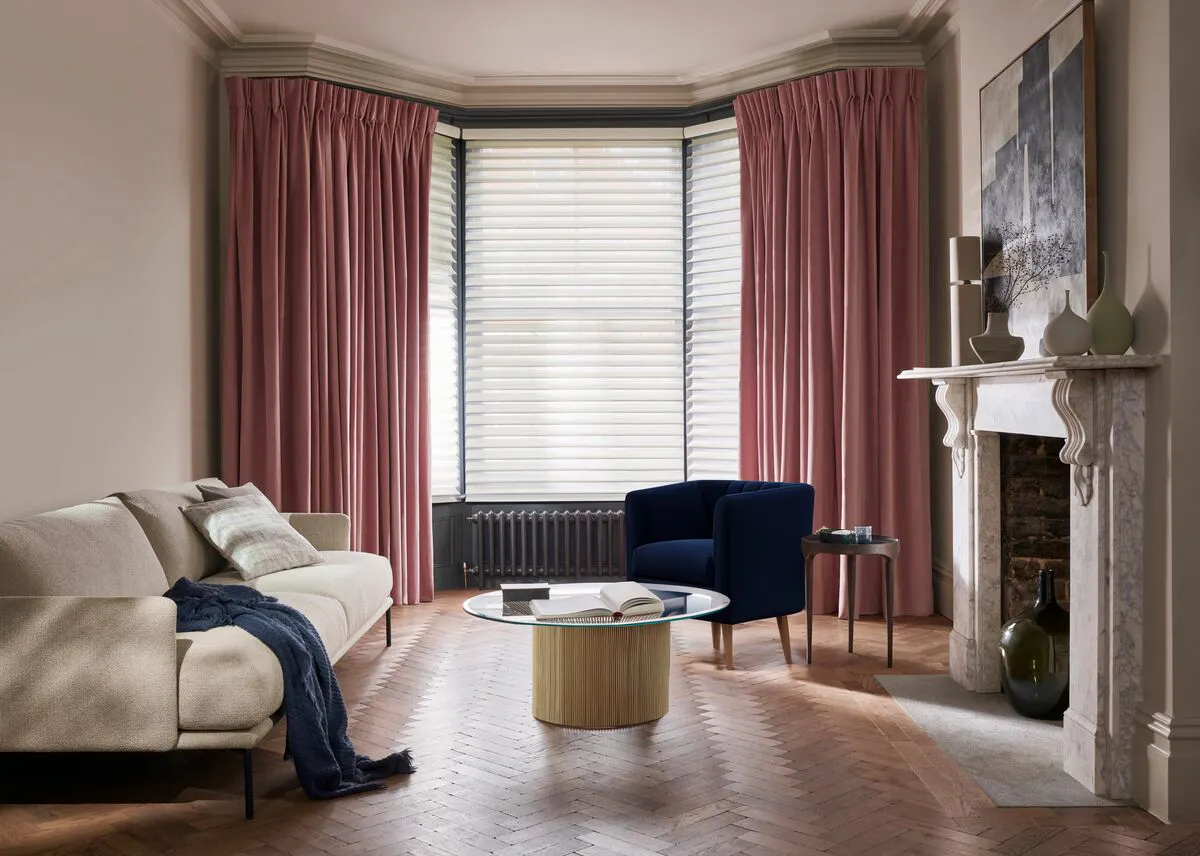
Elegant living room with pink curtains, a beige sofa, navy armchair and glass coffee table beside a marble fireplace.

Matching curtains with blinds is a really easy way to mix and match colours, textures and patterns and create a gorgeous focal point for any room. It’s also great for layering practical solutions with more stylish ones, so the finished result not only looks stunning, but works hard too. Read out handy guide to discover how to get the best results from matching blinds and curtains.
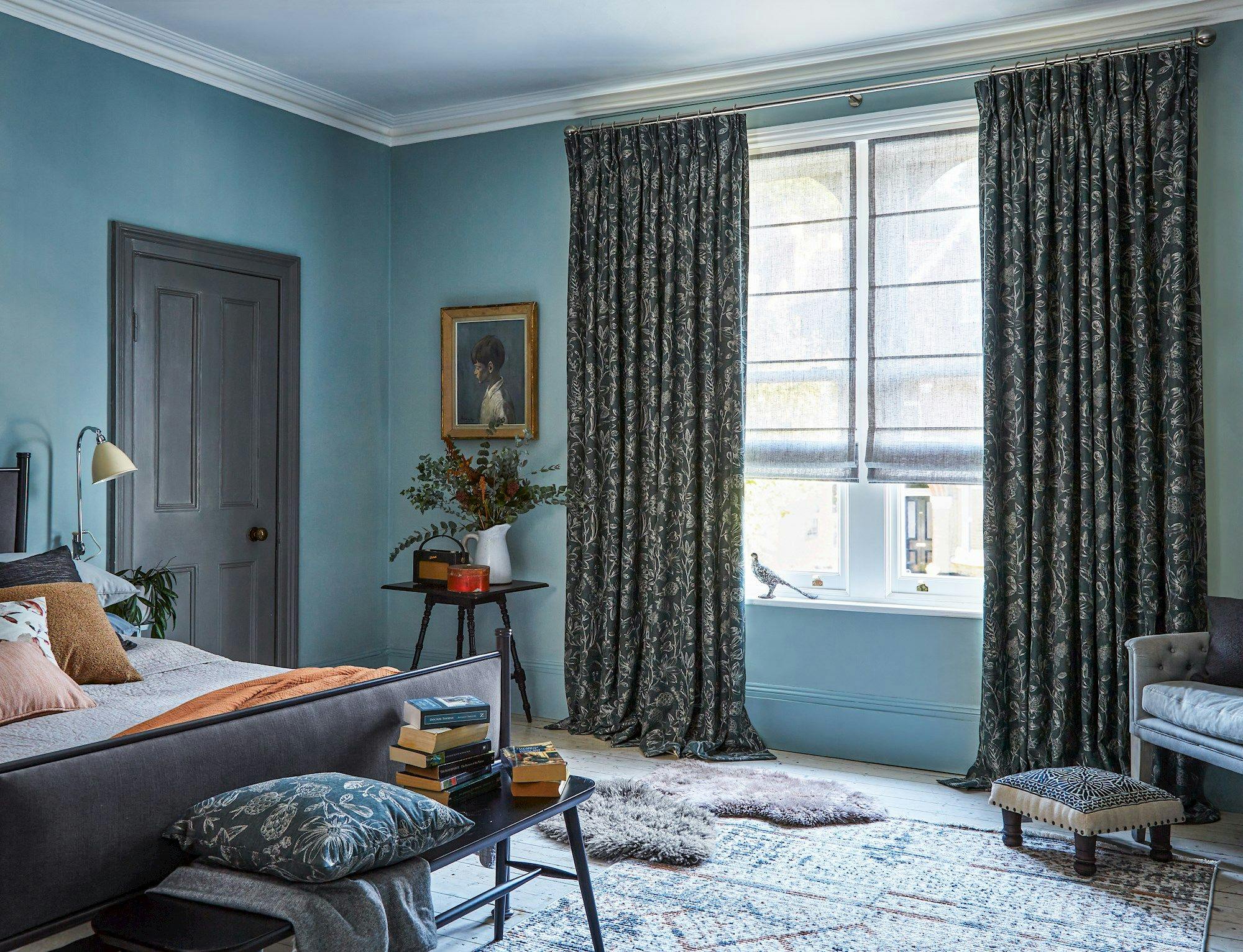
A cozy bedroom features a neatly made bed, books stacked on a bench, and a side table with a vase of flowers. Curtains frame a window, brightening the blue-painted room.

Function and style

Layering window dressings is great if you’re looking to solve a problem such as light levels, privacy or temperature control

This wide window lets in plenty of light, so we've chosen a sheer Voile Roman blind to help diffuse some glare while maintaining day time privacy. Sheer curtains would work too. 

Pairing sheer window treatments with lined curtains softens the space and makes it cosy at night. Choosing a blackout lining will help reduce the amount of light creeping it to create a darker environment for sleeping, plus add an extra insulating layer at your window to keep your room at a comfortable temperature.  

Practical solutions

Large areas like kitchen diners often have multiple windows and doors. 

Windows in a kitchen area may need to be more practical to withstand heat and steam, while dining spaces might call for softness and style. 

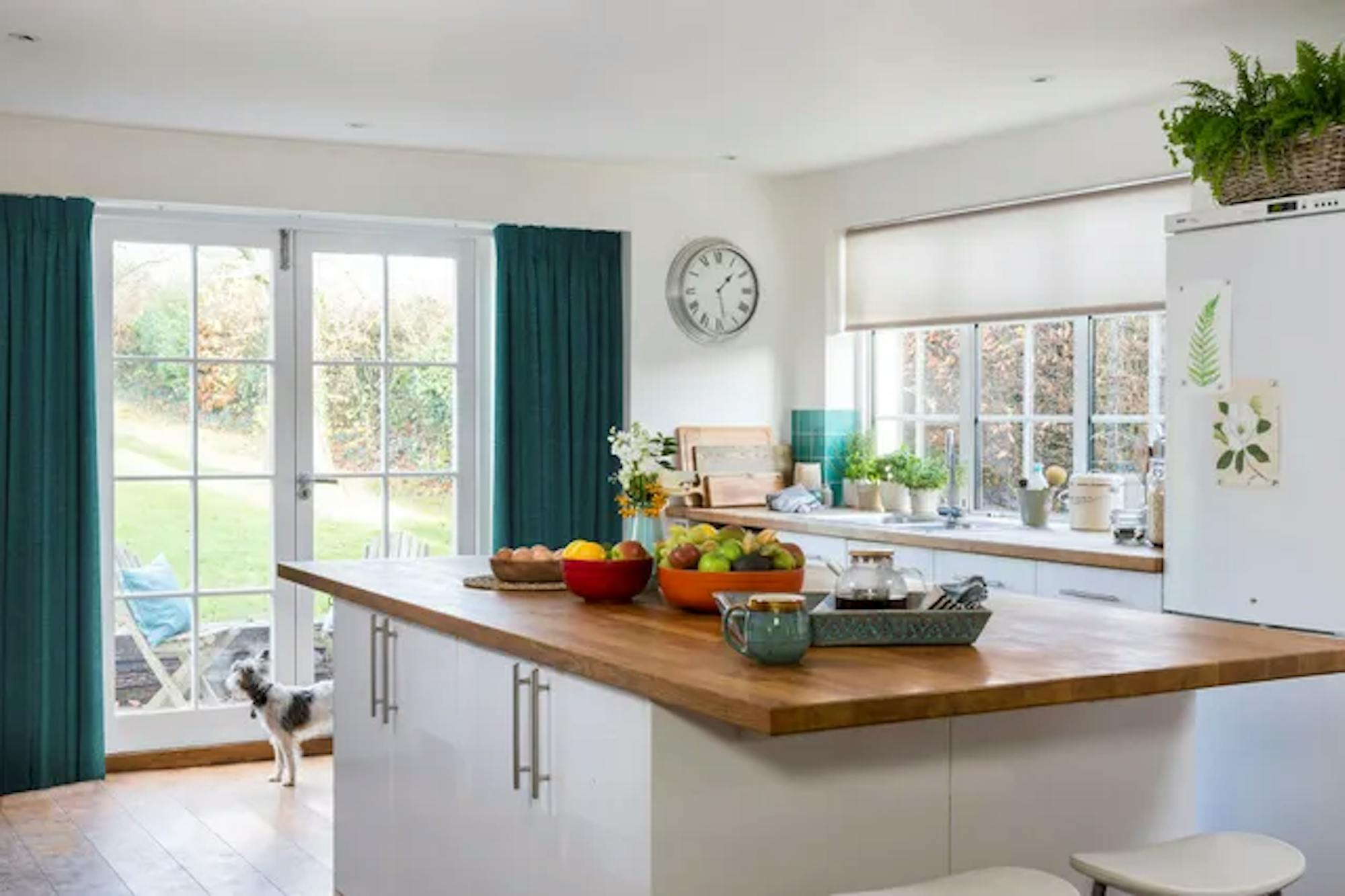
Here, we've opted for a wipeable Roller blind by the sink. It's a really practical choice thanks to the moisture resistant finish. We've also introduced a vibrant teal with blackout curtains at the door. They not only add a fun pop of colour to the room, but will help with light control plus lock in the heat and stop any draughts from the doors over winter. 

Velvet teal roman blind under white and green patterned curtains in a dark, modern dining room

Play with pattern

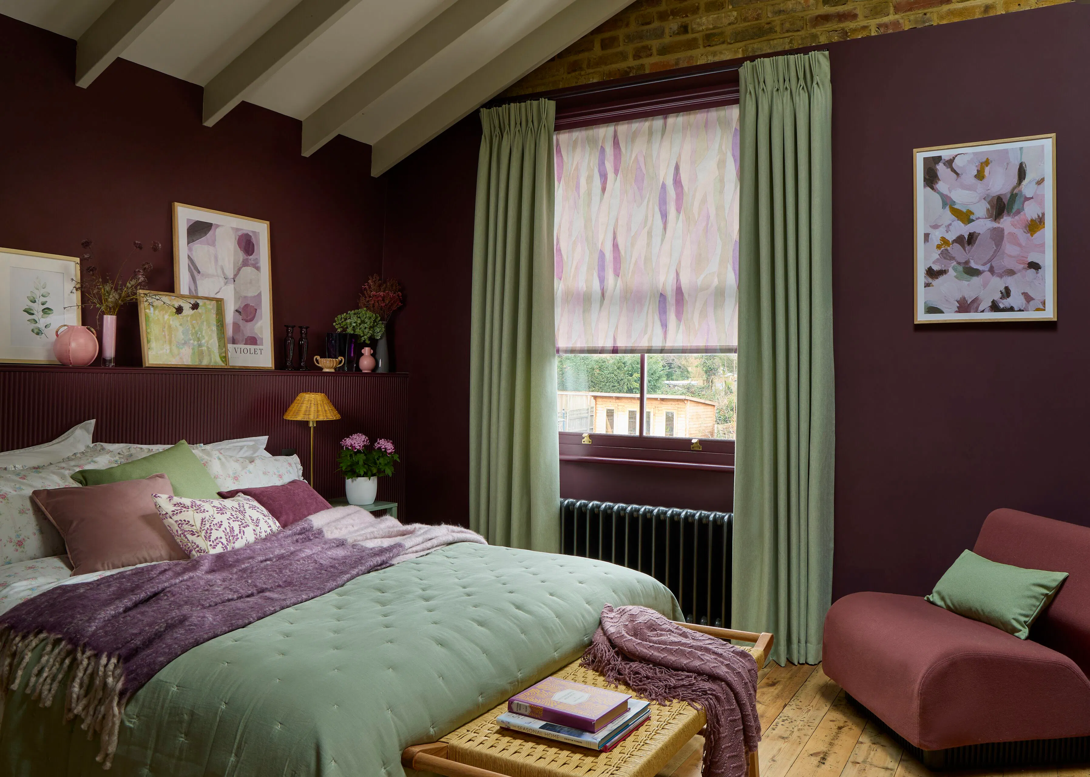
Pattern is a great way to add interest to your décor. When matching plains and patterns, select a colour from your patterned blind or curtains and use a similar or related colour for your matching plain fabric. 

Here, a Roman blind in Darcia Velvet Teal is the perfect background for curtains in Loxly Emerald. Velvet is one of the cosiest fabrics, making it a great choice for your windows. The thick, heavy nature of this luxurious material not only blocks out light but makes it perfect for insulation too. 

  • “Pattern is the quickest way to refresh a room - add a rug, pillow, and a great window treatment, and you’ll instantly inject personality and pizzazz.” 

    Jonathan Adler, Interior Designer

Top Header image CURTAIN_LINDORA_SILVER_ROMAN_HOWARD_CHARTRUESE_

Create synergy with a single shade

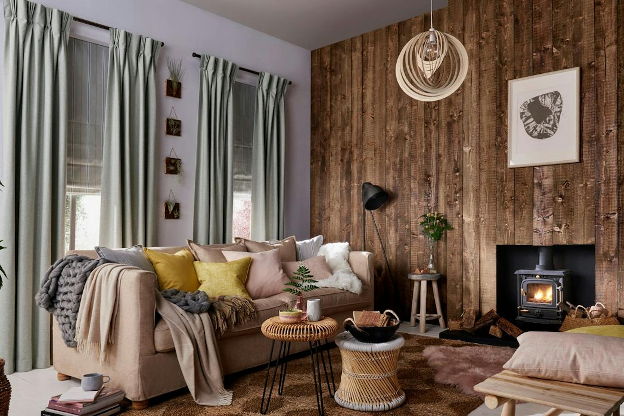
By using the same colour scheme throughout a room you unify your décor, creating a harmonious and balanced space. In this living area, we’ve taken inspiration from the neutral shade of the walls and picked a silver hue for the curtains and blinds. 

The silver shade reflects the light, making the room feel open and breezy while textured cushions and throws keep things cosy when you need it. It's not just about making things look good; it's about creating a vibe that feels right. 

  • “I love a neutral colour palette, which allows me to easily swap out fabrics, throws, and cushion covers with the seasons.” 

    Luke Catleugh, Lifestyle content creator

Choose contrasting tones for an eye-catching look

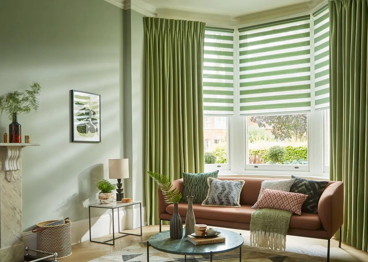
For more of an eye-catching look, choose contrasting tones to bring extra depth and character to your space. 

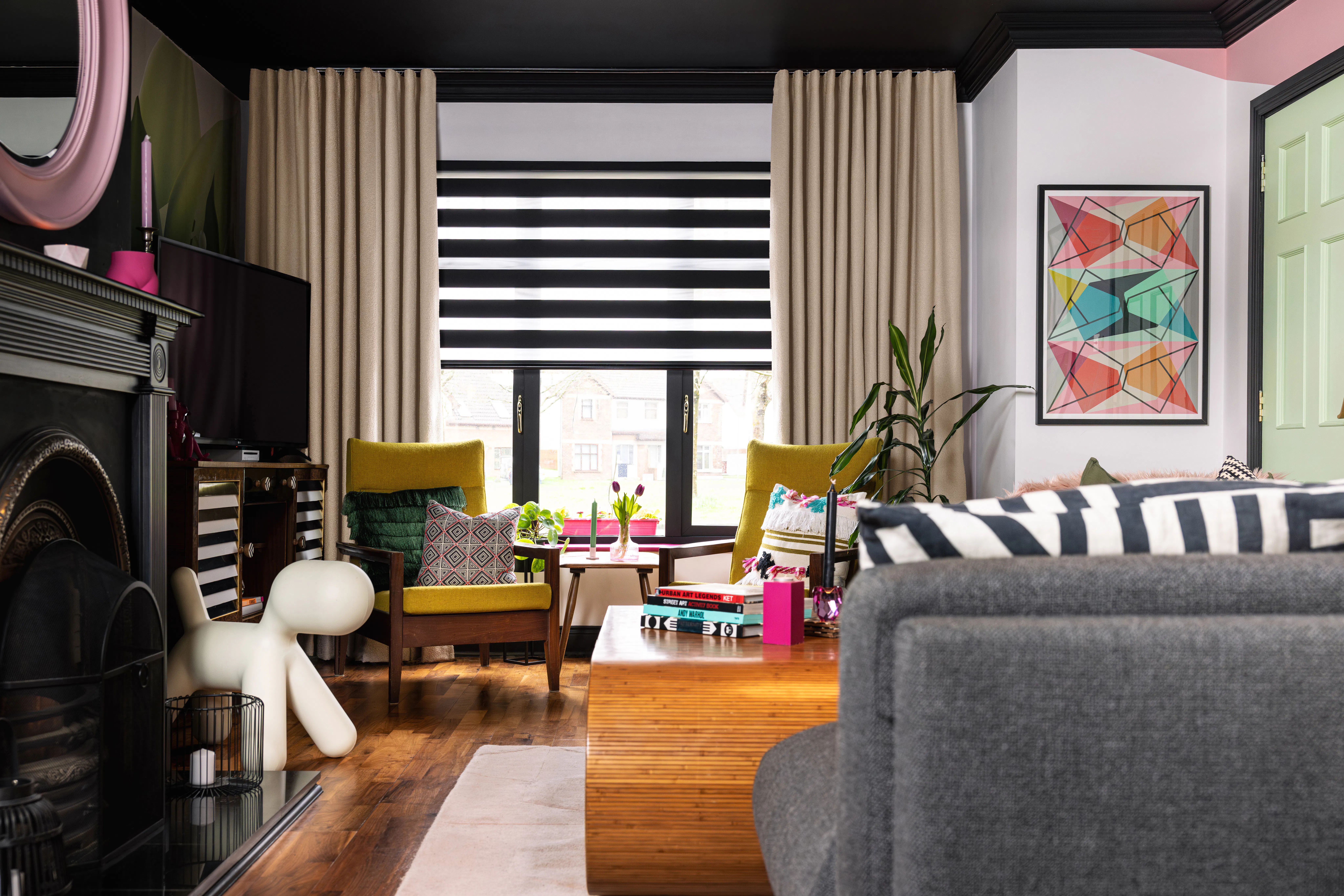
Here, we’ve paired neutral curtains with striking Day and Night blinds. Their distinctive striped design naturally introduces contrast, helping to frame the window and create a focal point. It’s a great choice if you’re looking to add visual interest while keeping the overall scheme balanced. 

The key is to create a look that feels cohesive. Picking up tones from furniture, artwork or accessories can help tie everything together, so the contrast feels intentional rather than overpowering. In this room, black and grey accents, colourful artwork and soft neutral fabrics work in harmony to create a layered look that’s bold and full of personality. 

  • “Colour not only influences your mood and mindset, but it also helps add personality and character to a space.” 

    Gemma Gear, TV Art Director, design producer and interior stylist

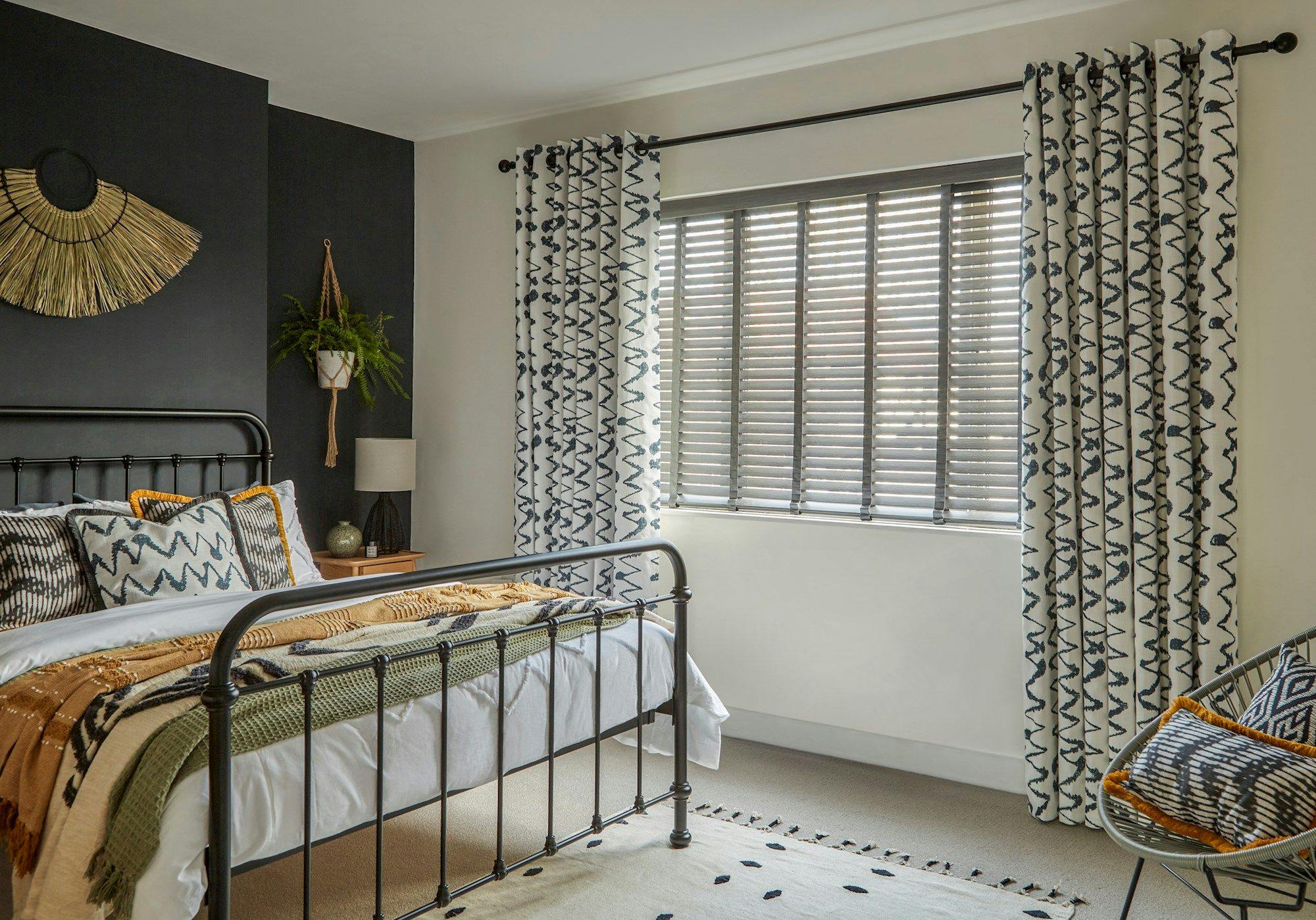
Wood Venetian Mirage Faux Wood Charcoal Blinds paired with Wolfe Smoulder Curtains in a bedroom with a bed on the left side

All the trimmings

Here we've layered faux wood blinds in a charcoal shade with curtains from our Abigail Ahern collection for a cosy, cocooning effect. 

With the curtains open, the faux wood blinds let in plenty of light while keeping the room private. 

For a dramatic finishing look, we've chosen cushions in matching patterns to the curtains. Most of our curtain fabrics are available as cushion covers and we offer a range of cushion sizes and edging options to complement the fabric at your window. 

Key takeaways: How to match curtains and blinds

  • Match similar shades for a calm, cohesive look, or contrasting tones to bring personality and visual interest. 
  • Layer different textures and fabrics to add depth and character. 
  • Repeat colours and patterns from around the room to create a pulled-together finish. 
  • Finishing touches like matching accessories help tie the look together. 

There’s so much more to see...

Take a look at more style inspiration and practical advice