Request an appointment
  • Price Promise

  • Rated Excellent

  • Fully Guaranteed

  • Over 40 years of value

Hillarys homepage1800 882 9171800 882 917Request a brochureRequest an appointment

What colour goes with orange? Six bold and beautiful interior combinations

Victoria Robinson product manager Author Victoria RobinsonProduct ManagerWritten 01/06/2026
Colourful dining room with patterned curtains, a modern chandelier, green feature wall, and a wooden table with mixed retro‑style chairs.

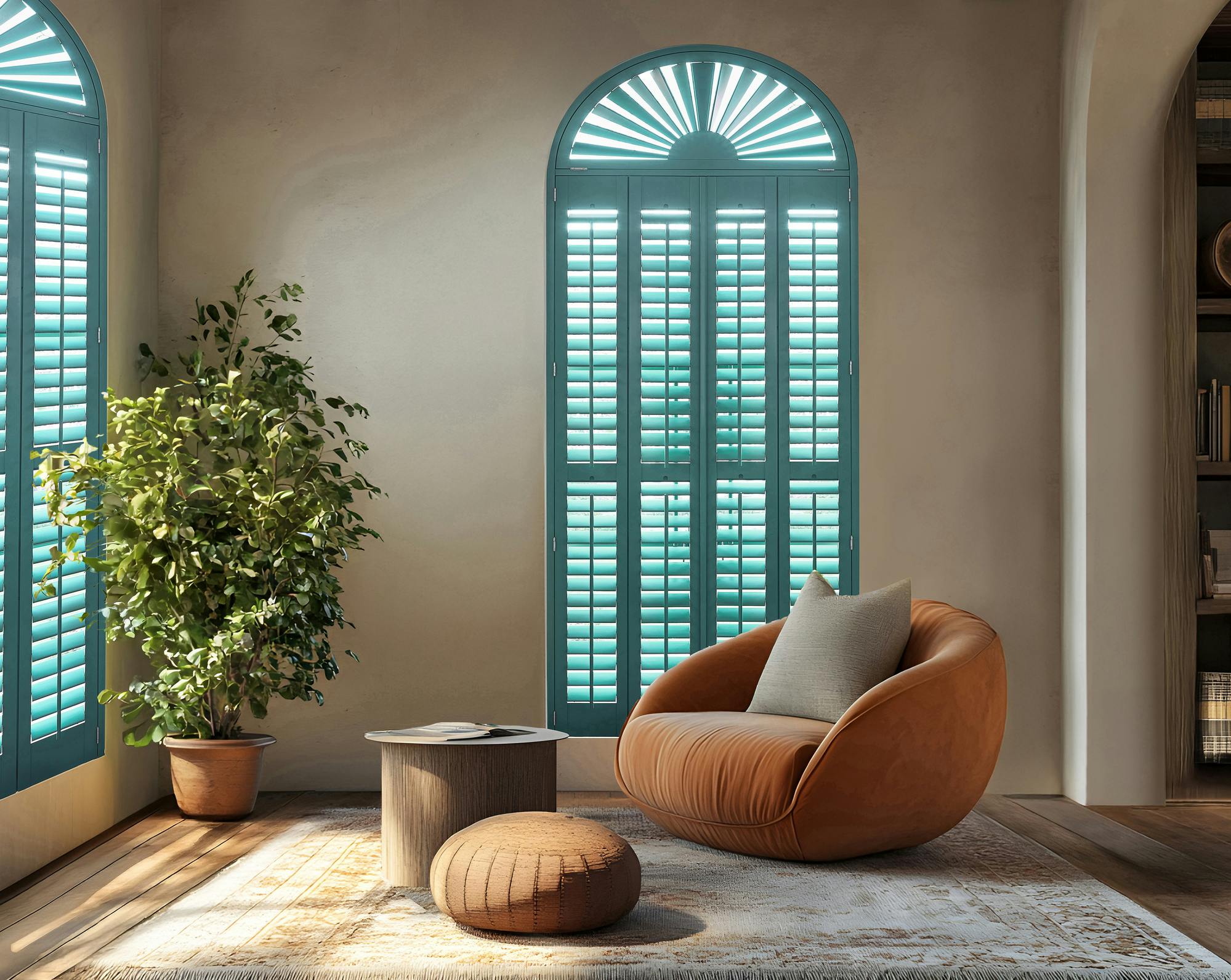
Orange is energetic, confident and full of warmth. Pairing orange with the right shades is the secret to making it feel stylish rather than overwhelming. 

From calming neutrals to brighter hues, these six colour combinations show how shades of orange can shine throughout your home. 

Bright bay window dressed in a soft grey Roman blind, framed by rich orange curtains that add warmth to the neutral living room.

1. Orange and grey

Grey is one of the easiest colours to live with alongside orange. It softly grounds orange tones, giving them space to glow without overpowering the room. Together, they create a look that feels modern, balanced and effortlessly stylish. 

How to use them: 

Pair orange curtains with grey Roman blinds for a layered look that feels warm and refined. This combination allows the vibrancy of orange to take centre stage, while soft grey adds a calming contrast. To pull the look together, tie in matching accessories such as cushions, throws or artwork.

Arched window fitted with teal Shaped shutters, filtering daylight into a calm seating nook with neutral walls and warm wooden flooring.

2. Orange and blue

Confident and statement-making, orange and blue make a striking pair. Whether you lean towards inky navy or softer blue shades, blue gently balances orange’s warmth, creating a space that feels lively yet considered.

How to use them:

If you’re looking to add character to your space, team blue coloured shutters with orange walls or furniture. Shutters allow you to control light levels throughout the day, so you can enjoy bright mornings and cosier evenings. The colour combination is a great choice for living rooms and dining spaces where practicality and personality go hand in hand.

Bay window with a light blind softening daylight, overlooking greenery and brightening a modern kitchen with warm red cabinetry and island seating.

3. Orange and white

If you love orange but want to keep things light and airy, white is your perfect partner. Pairing white with a slightly rustier orange helps creates a fresh, open feel while still letting those warming orange tones shine through.

How to use them:

Team orange Pleated blinds - like this design from our House Beautiful collection - with a white interior scheme for a clean, modern look. Sleek and stylish, Pleated blinds offer a clever way to control light, heat and privacy while keeping your space feeling bright and open. The pairing is perfect for kitchens and living rooms where orange accessories add a welcoming pop of warmth.

  • "If you have an existing bold pop of colour on a wall, or maybe colourful, bright window dressings, then mirror those colours around the rest of the room to help accentuate it. This could be through soft furnishings, and artwork that complements the main feature."

    Gemma Gear, Interior Stylist

A cosy living room featuring two windows dressed with Roman blinds, filling the space with soft light.

4. Orange and pink

Looking to bring a playful pop of colour into your home? Orange and pink are a joyful match. Pink softens orange’s intensity, resulting in a palette that feels vibrant, expressive and full of life.

How to use them:

Pair orange furniture with pink décor for an uplifting look. In this living room, the orange sofa creates a bright anchor for the space, while pink prints and accessories add softness. To tie the scheme together, layer in a patterned Roman blind, like this fabric from our Jonathan Adler collection.

Large glazed doors framed with sheer Voile curtains and green curtains, opening the living room to garden views and filling the space with light.

5. Orange and green

Orange and green sit surprisingly well together, especially when you choose muted or earthy greens. Inspired by nature, this combination feels calming and restful, making your space feel harmonious and easy to relax in.

How to use them:

Team orange accessories with green curtains layered with Voile curtains for a relaxed, versatile look. Voiles gently filter natural light during the day, while the curtains offer comfort and privacy when needed. Together, green tones and warming orange details create a space that feels calm and cosy.

Row of windows fitted with orange and yellow blinds, casting warm light into a colourful bedroom with mural artwork and a compact workspace.

6. Orange and yellow

Warm and welcoming, orange and yellow are a natural duo. Yellow enhances orange’s glow, filling your space with light and positivity. Used together thoughtfully, they create interiors that feel cheerful and full of energy.

How to use them:

If your child’s favourite colours are orange and yellow, Transition™ blinds are a perfect place to start. This lively combination brings instant personality to the room, helping create a space that feels fun and uplifting. Pair them with colourful walls and coordinating accessories to build on the look, creating a room your child will love to spend time in.

So, what colour goes with orange?

From bold pinks and soft greens to vibrant yellows, orange can be styled in ways that feel playful, polished or perfectly balanced. Whether you’re drawn to subtle accents or ready to make a statement, these colour pairings will help you use orange in a way that feels right for you and your home.

Nora putty floor length eyelet curtains in cosy pink themed living room

Tips for using orange at home

  • Balance is key: Orange is naturally bold, so letting it share the space with calmer colours or softer textures helps it feel warm and welcoming rather than overwhelming.
  • Think about the room’s purpose: Orange brings energy and positivity, making it a great choice for sociable spaces. For rooms where you want a calmer feel, opt for muted or rust-toned oranges to keep things relaxed.
  • Consider light levels: Bright rooms can happily take richer orange tones, while softer, muted oranges work best in rooms with less natural light.

Quiz: What colour should you pair with orange?

Not sure which colour pairing is right for your home? Answer the questions below, note down your letters, then find your match at the end.

Results

Tip: If your answers are mixed, try combining a couple of these colour pairings and layering them for a look that’s uniquely yours.

Related articles