Request an appointment
  • Price Promise

  • Rated Excellent

  • Fully Guaranteed

  • Over 40 years of value

Hillarys homepage1800 882 9171800 882 917Request a brochureRequest an appointment

Perfect pairings: six colours to use with red in your home

Yvonne kneel product designer holding roman blindAuthor Yvonne KealProduct Management SpecialistWritten 02/02/2026
Hillarys Morris Beet Wave Curtains in the dining room

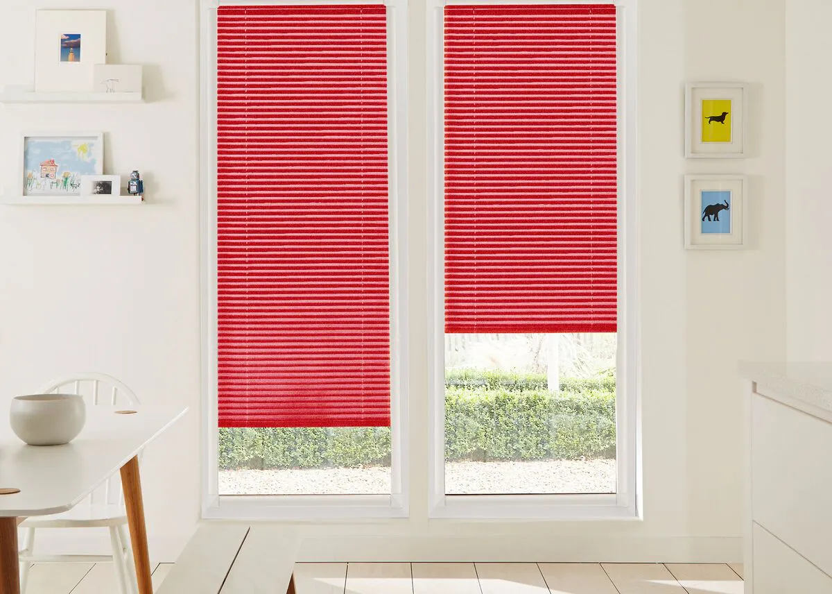
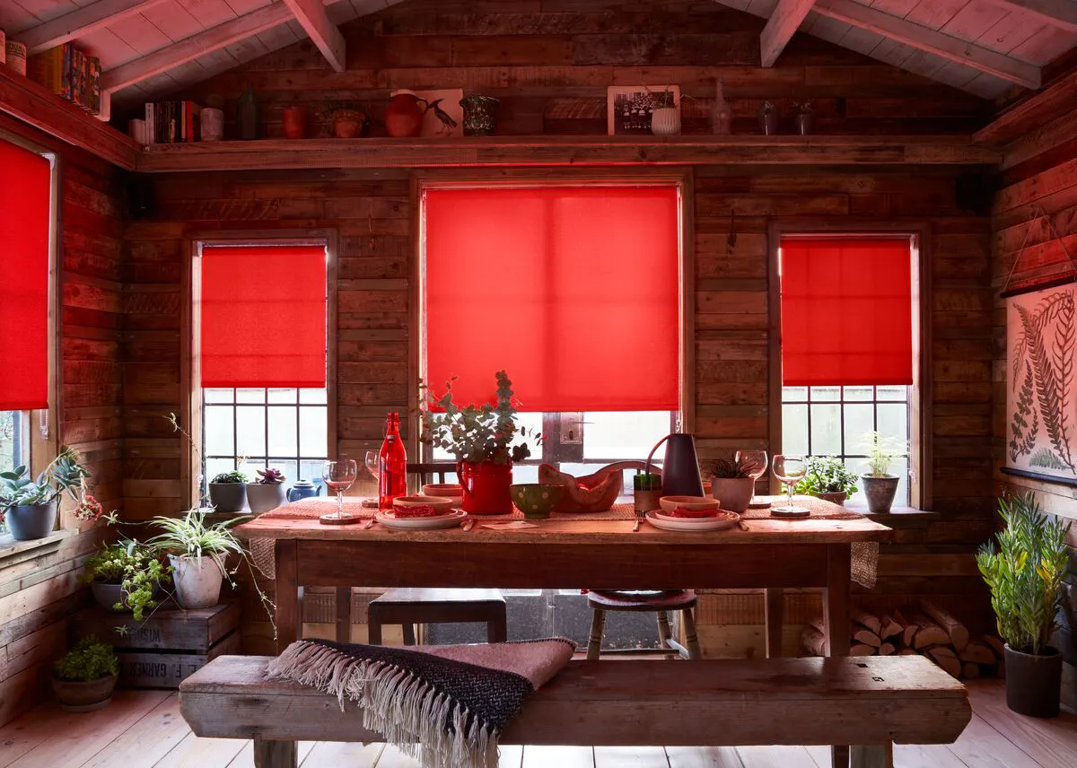
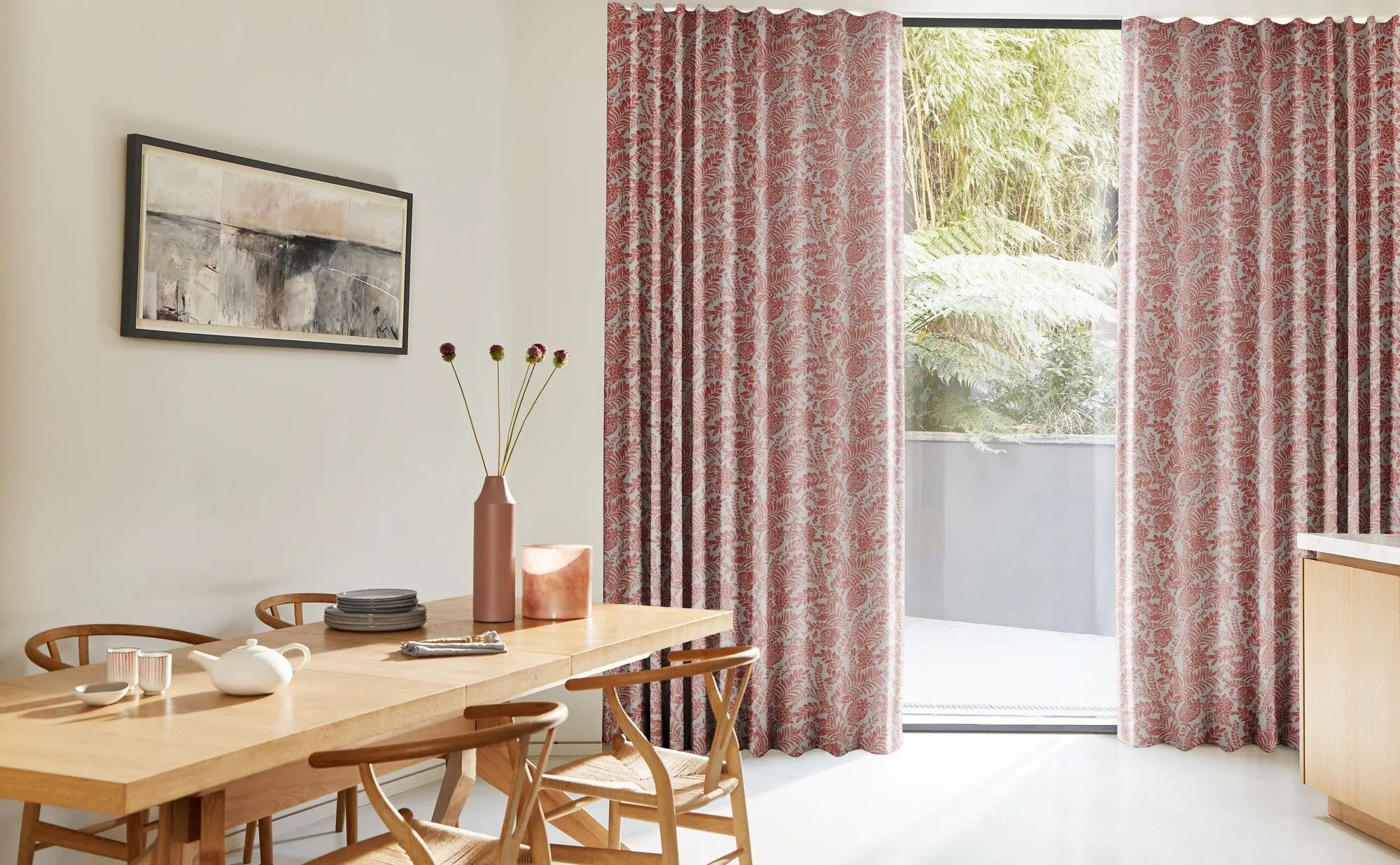
Red is a colour that never fails to make a statement. Whether you prefer bold cherry, deep burgundy, or a softer blush, red can bring energy, warmth, and personality to any space. However, finding the right colours to complement red is key to creating a balanced and inviting atmosphere.

Here are six colours that pair beautifully with red, along with ideas for incorporating them into your home’s décor.

Bright kitchen with two large windows fitted with vibrant red pleated blinds, overlooking a neat green hedge.

1. Crisp whites

White is a timeless companion for red. The clean simplicity of white allows red to stand out without overwhelming the space. This combination creates a fresh, bright, and classic look that works well in both traditional and modern interiors.

How to use them:

Red blinds against white walls offer a striking contrast, while white window dressings can help balance red furniture or accessories. This pairing is particularly effective in kitchens, living rooms, and entrance halls.

Moody grey bedroom with a black spindle bed, red patterned bedding and deep red shutters on the window.

2. Sophisticated greys

Grey is a versatile neutral that brings a sense of calm and sophistication to red’s vibrancy. From pale dove to deep charcoal, grey tones ground red and create a contemporary, elegant feel.

How to use them:

For a dramatic look, try pairing charcoal grey walls with deep red window dressings, like these custom colour shutters. The rich red against the dark grey creates a striking contrast. This combination works especially well in bedrooms and living spaces, where the grey creates a restful backdrop, and the red adds warmth and personality. To pull the look together, introduce red accessories - such as artwork, bedding, or lamps.

  • “If you have an existing bold pop of colour on a wall, or maybe colourful, bright window dressings, then mirror those colours around the rest of the room to help accentuate it. This could be through accessories, soft furnishings and art that complements the main feature.”

    Gemma Gear, Interior Stylist

A cozy bedroom features a bed with striped bedding and a colorful quilt, a teddy bear sitting on it. Books and toys are on shelves under a window with red-checkered blinds. A picture with a flower and the word �bonjour� is on the wall.

3. Beautiful blues

Blue, in all its shades, is a wonderful complement to red. Whether you prefer the richness of navy, the freshness of sky blue, or the calm of teal, blue’s cool tones balance red’s warmth, creating a look that is both lively and harmonious.

How to use them:

For a stylish kid’s bedroom, consider pairing blue walls or bedding with red patterned blinds. This combination brings a sense of energy and personality to the room, while still feeling restful and inviting. Lighter blues paired with red create a fresh, uplifting atmosphere, while deeper blues and red add drama and depth. Add a few red accessories - such as cushions or shelving - to tie the scheme together.

A bedroom features a bed with green linens and a gray throw. Pink curtains frame a window with floral blinds. Decorative elements include a woven rug, pendant light, and wall hanging.

4. Earthy greens

Green and red sit opposite each other on the colour wheel, making them natural complements. While classic red and green might evoke festive thoughts, earthy rust shades paired with sage or forest greens create a harmonious and grounded look.

How to use them:

Try red curtains alongside green walls or accessories for a cosy, nature-inspired atmosphere. Olive green window dressings can also beautifully offset rust-toned soft furnishings or walls. This combination works especially well in living rooms and bedrooms, bringing in the warmth of autumn. To finish the look, layer in natural textures like wood, linen, or rattan.

Room features a cozy sofa with colorful pillows, a wicker coffee table with decor, and a side table with a lamp. Pink curtains frame large windows. Wall art includes "BONJOUR" text.

5. Warm neutrals

Warm neutrals such as taupe, beige, or sand soften red’s boldness and create a welcoming, relaxed atmosphere. These colours are ideal for spaces where you want comfort and understated style.

How to use them:

Pair red striped curtains with neutral walls and furnishings for a fresh, balanced look. The stripes add visual interest and a pop of colour, while the taupe or beige decor keeps the overall feel calm and inviting. Add textured throws, rugs, or cushions in similar neutral tones for depth and warmth. This combination works particularly well in living rooms, and dining spaces where you want a touch of vibrancy without sacrificing comfort.

Rustic wooden dining room with red roller blinds, potted plants and a wooden table set with red-toned tableware.

7. Rich browns

Brown is a wonderfully grounding colour that pairs beautifully with red, creating a warm and inviting atmosphere. Natural wood tones - whether light oak, deep walnut, or rich mahogany - bring out the richness of red.

How to use them:

In a dining room, consider pairing vibrant red blinds with natural wood furniture or flooring. The warmth of the wood balances the boldness of the red, making the room feel cosy and welcoming - ideal for gatherings and shared meals. You can enhance this look with wooden stools or benches and a solid wood table, allowing the red to stand out as a vibrant focal point. This combination works particularly well with earthy accessories and soft lighting, creating a space that feels cosy and homely.

Beige day and night blind covering large garden bifold doors

Tips for using red at home

  • Balance is essential: Red is a strong colour, so pair it with neutrals or softer shades to keep the look harmonious.
  • Consider the room’s purpose: Red adds energy and warmth - perfect for living rooms and kitchens. For bedrooms, combine it with calming hues like grey or blue.
  • Pay attention to light: The amount of natural light can influence how red and its partner colours appear. In north-facing rooms, warmer reds and neutrals can add cosiness, while in brighter spaces, cooler tones like grey or green offer balance.

Red can be bold or subtle, depending on how you use it and the colours you choose to pair it with. Whether you’re updating your window dressings or adding red accents elsewhere, these combinations provide inspiration for a stylish and inviting home.

Quiz: What colour should you pair with red?

Not sure which colour to choose with your red décor? Answer these quick questions to find your perfect match.

Results

Tip: If your answers are mixed, try layering a couple of these shades for a look that’s uniquely yours.

Mostly As

Moody navy - You love classic, tailored looks. Pair white with navy for timeless style.

Mostly Bs

Soft greys - You prefer calm, understated elegance. Grey and white are your go-to.

Mostly Cs

Earthy greens - You’re drawn to natural, organic vibes. Green and white are perfect for you.

Mostly Ds

Blush pinks - You like soft, gentle spaces. Blush and white will create your ideal look.

Mostly Es

Warm taupes and beiges - You want warmth and comfort. Taupe or beige with white is your match.

Mostly Fs

Bold black - You love drama and contrast. Black and white is your power pairing.

Related articles: